
JioFinance · Product Design · Home
Rethinking Home for a growing financial ecosystem.
JioFinance was growing beyond payments into banking, lending, investments, insurance, rewards and money management. I worked with the team to rethink what Home should actually do — and how it could stay useful as the ecosystem continued to grow.
Home was solving too many problems at once.
The existing Home had grown organically as new products and business needs were introduced. Payments needed quick access. Loans and investments needed discovery. Partner products needed visibility. Rewards needed engagement. New money-management features also needed a place to live.
The problem wasn't simply that Home was long. Home didn't have a clear job anymore.
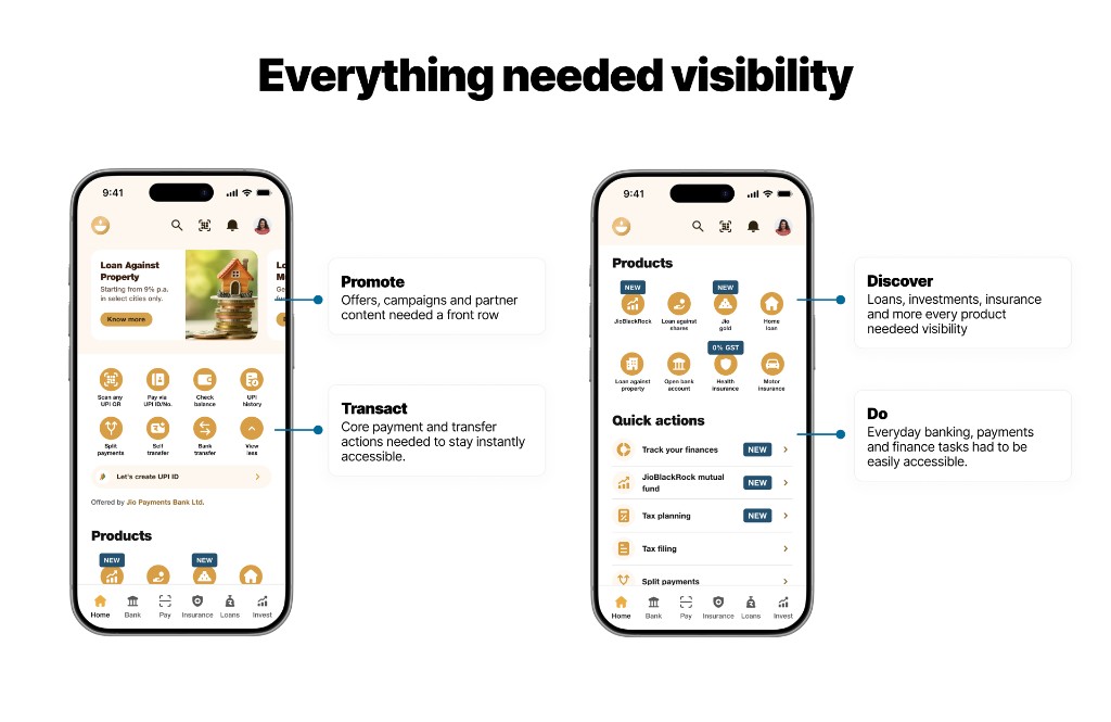
There were competing needs behind every screen.
This wasn't a clean redesign brief. The team was balancing product visibility, customer relevance, engagement features, partner requirements and a new AI-led way of navigating the app.

Before Figma, we worked through what Home should become.
Some of the earliest thinking happened on paper. We were questioning the basic structure — what stays global, what belongs on Home, where AI should live, and how users move between Home, Explore and the rest of JioFinance.
At this stage, I wasn't trying to design the final UI. I was trying to make the product model clearer.
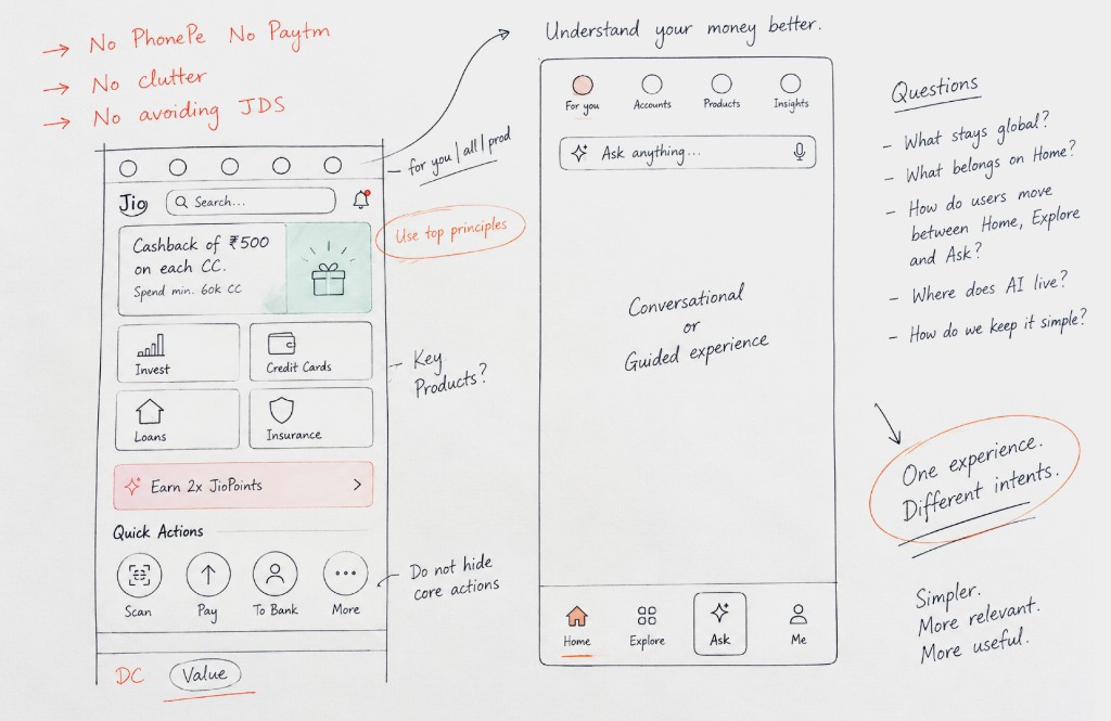
Home was only one part of the problem.
Some things needed to stay available everywhere — identity, search and assistance. Home could then focus on what's relevant now, while navigation provided stable access to the wider ecosystem.
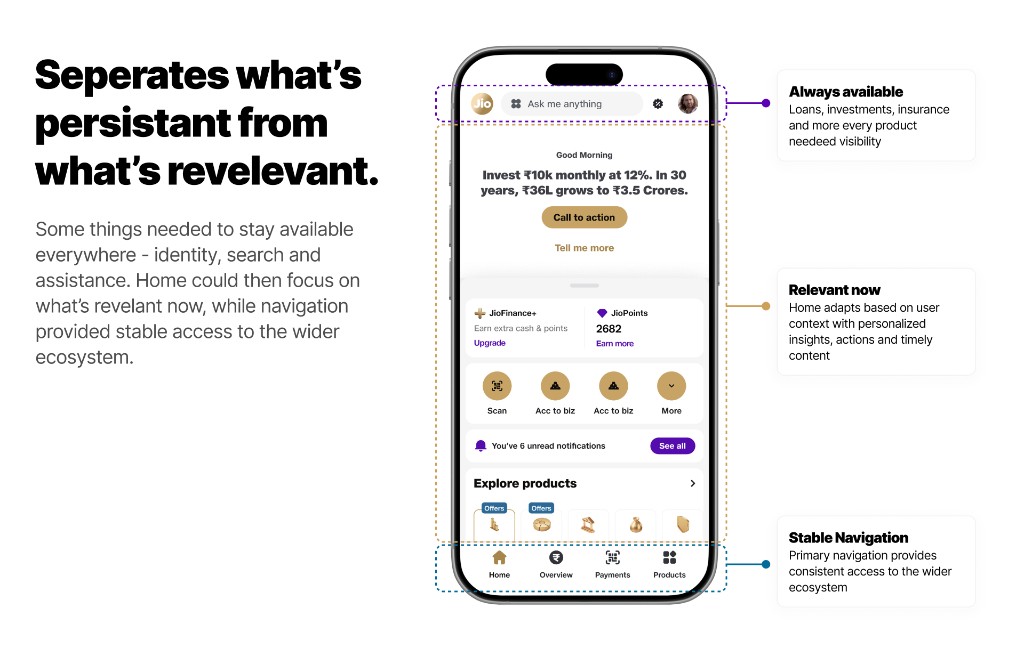
This helped separate orientation, discovery and engagement, and navigation instead of expecting the Home feed to do all three.
We looked at how large ecosystems handle discovery.
We looked beyond financial apps at products that already manage large ecosystems. The interesting pattern wasn't visual. It was how they separated frequent actions from discovery, used context to surface relevant content, and avoided putting their entire catalogue on the first screen.
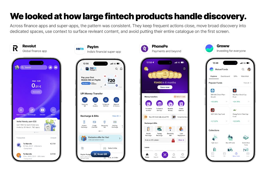
What belongs on Home, what belongs in Explore, and what can AI help the user find?
Home and Explore needed different jobs.
Home
Personal and contextual.
“What matters to me right now?” Money, ongoing journeys, relevant opportunities, rewards and things that need attention can come forward.
Explore
Broad and predictable.
“What can I do with JioFinance?” A place to intentionally browse the wider product ecosystem.
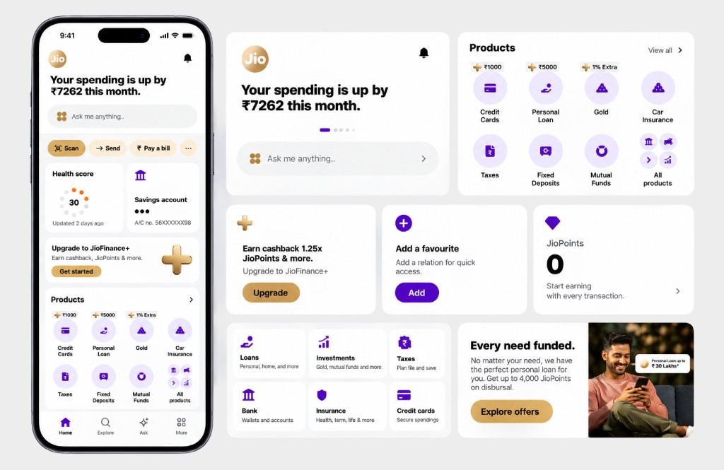
Getting there took several rounds.
One of the earlier directions still gave a lot of Home to product discovery. It brought JioPoints, promotions, Explore, recommendations and earning opportunities together, but it was still asking one screen to do too much.
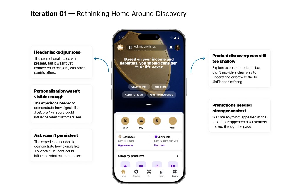
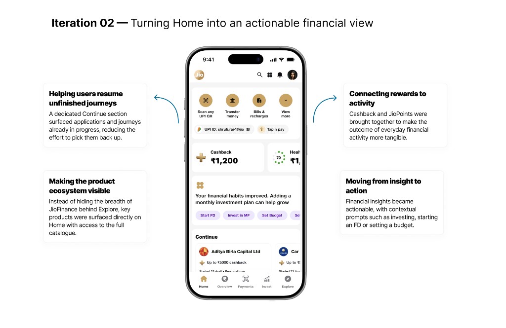
Make product discovery clearer. Give “For You” a stronger role. Keep “Ask me anything” available throughout the experience. Show the breadth of products without turning Home into a catalogue.
Should Home show what the business wants to sell, or what the user is likely to need?
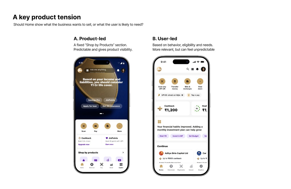
The direction moved towards both: stable ways to discover products, with contextual recommendations around them.
Home became a mix of stable structure and changing context.
The later direction gave each part of Home a clearer role instead of asking every module to compete equally.
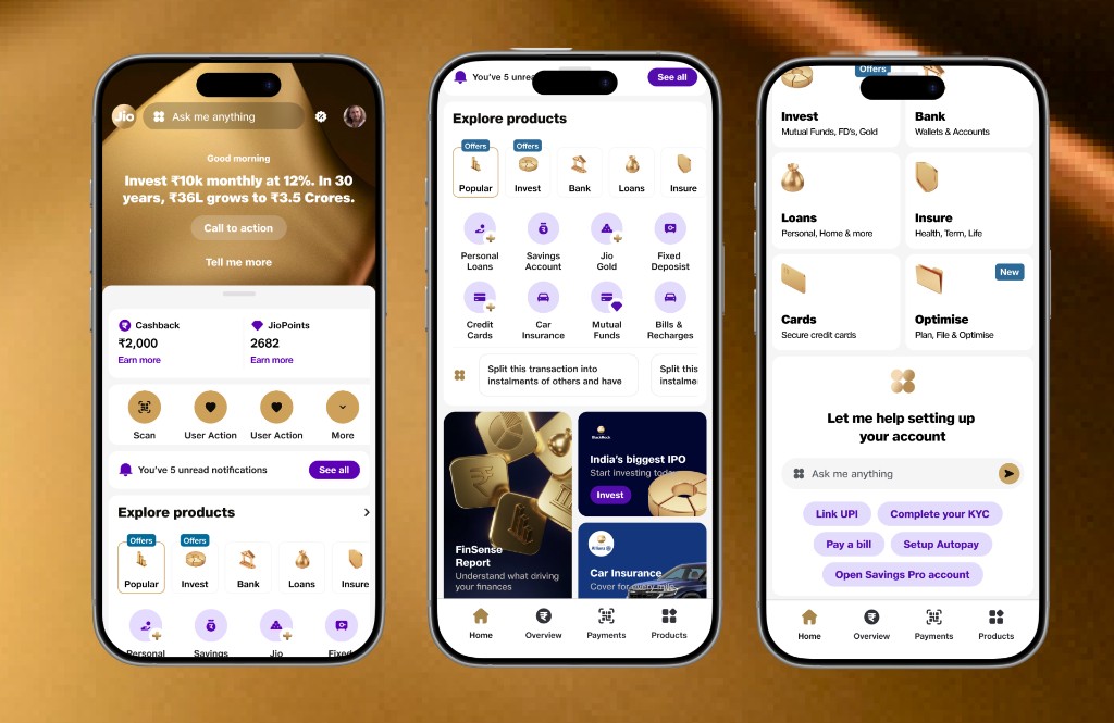
We started with a homepage redesign. We ended up defining the relationship between Home, Explore and AI.
The work gave us a clearer model for how JioFinance could grow without continuously adding more sections to Home.
The hardest part wasn't designing another Home. It was deciding what didn't need to be on Home at all.
back to jiofinance →